Our Work
Real examples of how clarity-first design solves problems across industries. B2B, ecommerce, schools, nonprofits, and service providers.
Case Studies
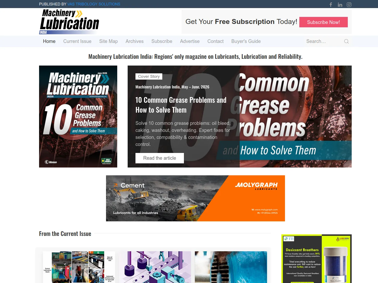
Industrial Equipment Manufacturer
This company manufactures industrial equipment for factories across India. Their website was slow, cluttered, and didn't clearly present their products or specifications.
Problems:
- • 15+ second load times on mobile
- • 40+ confusing pages with no clear hierarchy
- • Product information scattered and hard to find
- • Competitors had clearer, faster sites
Our Solution:
- ✓ Reorganized products into clear categories
- ✓ Built mobile-first responsive design
- ✓ Optimized all images and code for speed
- ✓ Added searchable specs and datasheets
- ✓ Clear inquiry forms for B2B buyers
Results:
30% more traffic within 3 months
5.2 second load time (down from 15+ seconds)
25+ qualified inquiries/month from the website
Online Handmade Products Store
This ecommerce store sells handmade products across India and internationally. Their WordPress site was slow and didn't highlight product quality clearly enough.
Problems:
- • High bounce rate—visitors confused about products
- • Poor product images and descriptions
- • Slow checkout experience
- • Cart abandonment rate of 65%+
Our Solution:
- ✓ Redesigned product pages with focus on storytelling
- ✓ Added high-quality images and zoom functionality
- ✓ Streamlined checkout process to 2 steps
- ✓ Mobile-optimized for India's shoppers
- ✓ Fast loading—images optimized for all speeds
Results:
42% decrease in bounce rate
35% more orders/month
Average order value up 18% due to clearer product information
International School
A school needed a website to communicate with students, parents, and prospective families. Their old site was outdated and hard to navigate.
Problems:
- • Parents couldn't find key information (schedules, fees, admissions)
- • Prospective families got lost trying to learn about the school
- • No clear application process
- • Outdated design didn't reflect school's modern approach
Our Solution:
- ✓ Clear navigation for different audiences (students, parents, prospects)
- ✓ Parent portal for grades and communications
- ✓ Simple admissions inquiry form
- ✓ Mobile-optimized for parents on-the-go
- ✓ Modern design showcasing school culture
Results:
25% more admissions inquiries
Parents report better information access
Reduced support emails by 40% through clear FAQs
Environmental NGO
An environmental organization needed to communicate their work, attract donors, and engage volunteers. Their website didn't convey impact clearly.
Problems:
- • Visitors didn't understand the organization's mission
- • Impact wasn't quantified or clearly shown
- • Donation and volunteer paths were unclear
- • Outdated design hurt credibility
Our Solution:
- ✓ Clear mission statement on homepage
- ✓ Showcased impact with stories and data
- ✓ Simple donation and volunteer sign-up forms
- ✓ Modern design reflecting environmental values
- ✓ Mobile-friendly for supporters on all devices
Results:
3x more monthly donors
50+ new volunteers signed up in first month
Increased foundation grant approvals due to better website credibility
Our Process
Discovery
We listen, research, and understand your business, audience, and goals.
Strategy
We define messaging, information architecture, and success metrics.
Design & Build
We create and develop—clarity first, then beautiful design.
Launch & Optimize
We launch and continuously improve based on real user data.
Ready to See Your Clarity-First Website?
Let's talk about your project and how clear UX can solve your business problems.
Schedule a Consultation